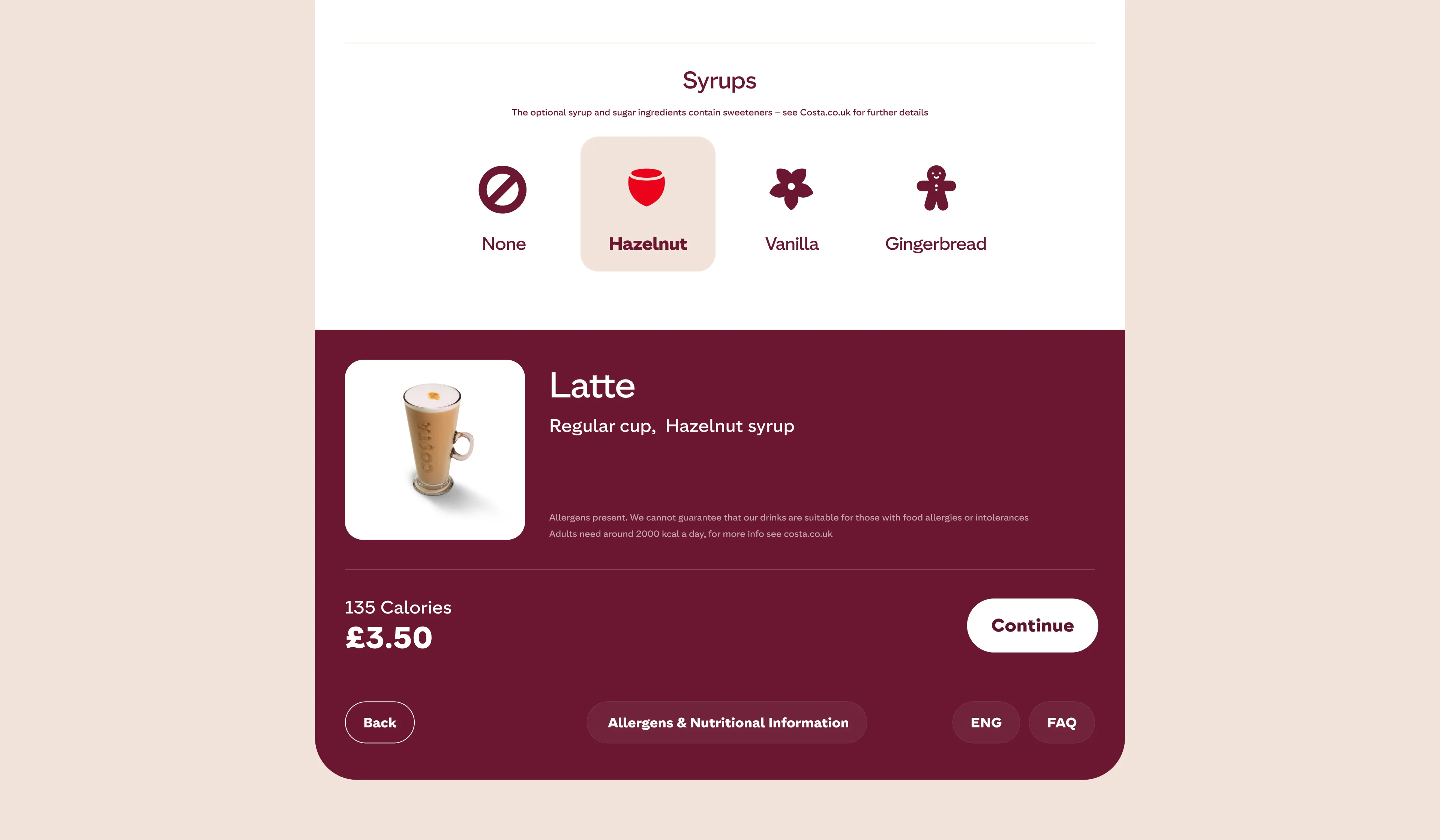
Brew developed a touch-based web interface for a renowned coffee brand’s self-service kiosks, bringing quality and convenience to busy locations.
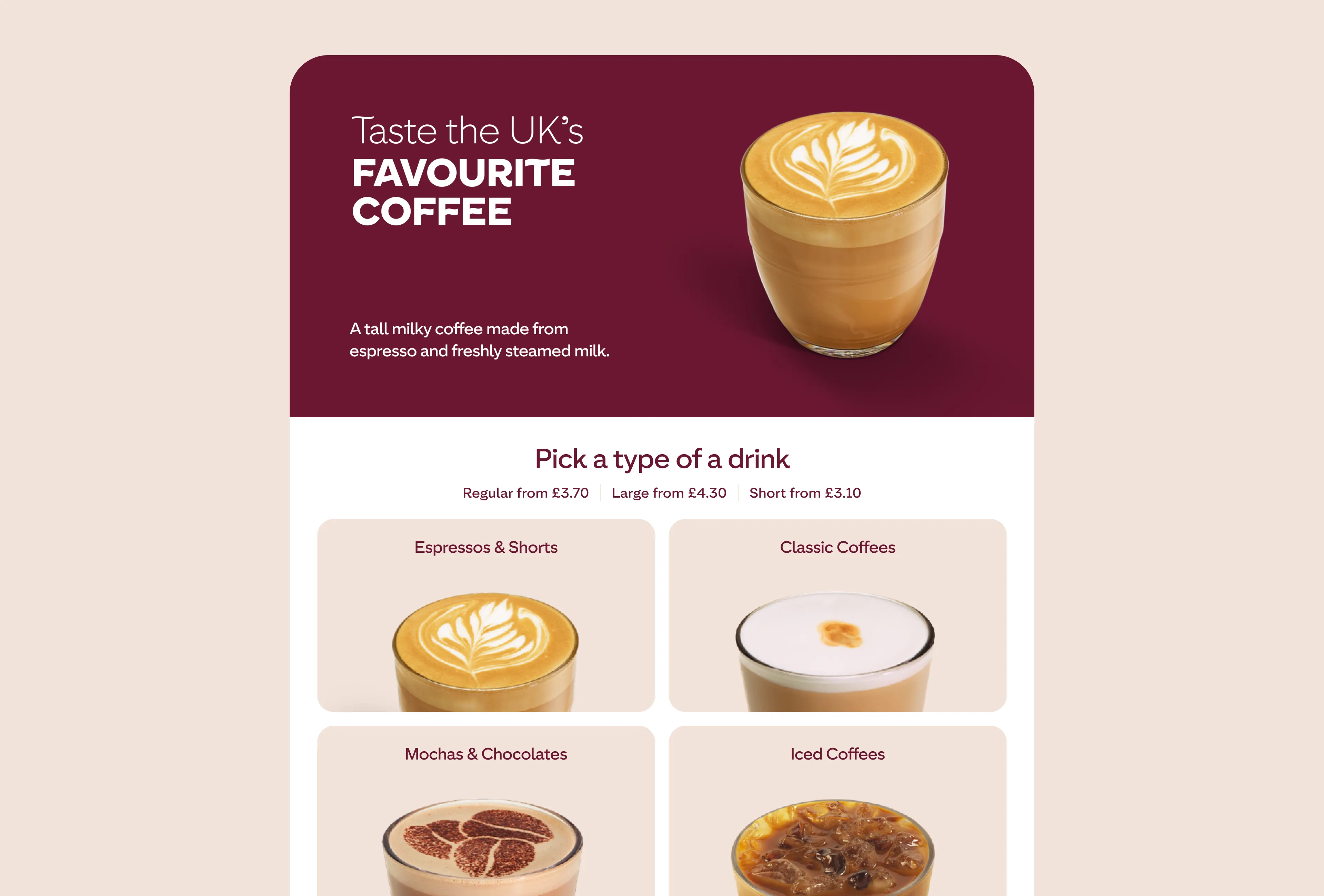
Brew is a self-service coffee kiosk with a touch interface designed to simplify the ordering experience in high-traffic locations such as retail stores, fuel stations, and transportation hubs. Users can select their preferred drink, pay via the interface, and receive a freshly prepared beverage within minutes – all without staff assistance. The product was already live in an earlier form and underwent a complete redesign, both to resolve key usability issues and later to align with an updated brand identity.
My Role
Position and responsibilities. As a Product Designer, I led the end-to-end kiosk interface design – from drink selection to pick-up – collaborating with cross-functional teams to deliver UX/UI solutions aligned with business and technical goals.
Collaboration. Close work with product and development teams to ensure feasibility and alignment.
Design system and scope. I redesigned the interface and built a scalable design system to ensure visual consistency across kiosk versions and screen sizes.
Research and testing. I led user research via remote testing on usertesting.com and in-person sessions with working kiosk prototypes to gather realistic feedback and identify pain points.
Design Process
Prototyping and iteration. We iterated in sprints, refining the interface based on testing and feedback to ensure a smooth, low-friction user flow suited for quick decisions in public spaces.
Technical constraints. Hardware limitations, like the inability to show brew time, required creative solutions. We used ambient animations and subtle cues to keep users informed without misleading indicators.
Brand adaptation. Midway through, I adapted all screens to a new brand identity, balancing visual updates with usability and performance.
Research and testing. I led remote and in-person user testing using Figma prototypes and working kiosks to gather realistic feedback and uncover usability issues.
Metrics
Conducted 3 rounds of iterative testing with potential users to refine UI and improve usability of key flows.
Introduced consistent iconography and component system in Figma, accelerating development handoff by ~25%.
Reduced cognitive load by restructuring navigation and prioritizing key actions — validated through internal testing and peer reviews.